")
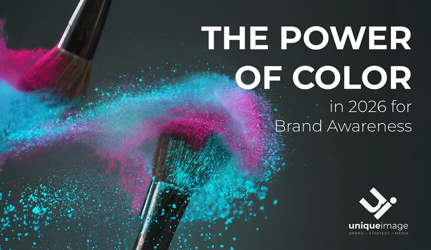
The Power of Color in 2026 for Brand Awareness
We have all experienced it: the involuntary pause. A scroll stops, a gaze lingers, and for a fleeting moment, a visual has your undivided attention. That reaction—that sudden sense of intentionality—is never an accident. It is the result of precision-engineered design.
Behind every iconic visual identity lies a rigorous intersection of structure, psychology, and data. The impact is quantifiable: 98% of consumers admit that color directly influences their purchasing decisions. Perhaps more telling is that nearly half of all consumers have opted for one brand over another based solely on its palette—a trend driven predominantly by the aesthetic-first sensibilities of Gen Z and Millennials.
At Unique Image, we treat color as a strategic lever to shape perception, command authority, and scale brand awareness in unison. As we navigate 2026, this discipline has never been more critical. In an era defined by digital fatigue, heightened ecological consciousness, and the rise of AI-augmented design, how a brand "speaks" visually determines its place in the market.
The Architecture of Perception
Color theory is more than a creative choice; it is the study of how specific frequencies influence human thought patterns and subconscious behavior. In the high-end space, colors do the heavy lifting of:
- Establishing Perceived Value: Aligning your brand with luxury or accessibility before a single word is read.
- Triggering Emotional Resonances: Moving a client from a state of urgency to one of profound trust.
- Strategic Layering: Creating visual depth that cuts through the noise of a saturated, scroll-driven environment.
The moment you curate your brand's palette, you are not just choosing "colors"—you are defining an emotional ecosystem. You are signaling your brand's personality, its core convictions, and exactly who it is meant for.
Color today is both an emotional language and commercial leverage. Below, we explore how to transform your brand's color system from a mere aesthetic into a high-performing asset.
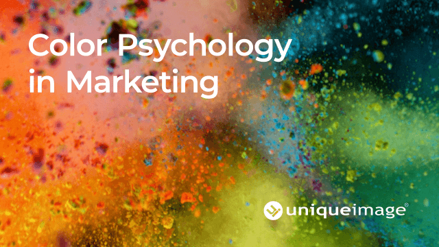
The Power of Chromatic Complexity
The science of engagement supports this need for intentionality. Research from the University of Notre Dame reveals that "color complexity" within social media compositions directly correlates with higher engagement rates. In a digital landscape of flat, muted templates, a richer and more varied color story acts as a sophisticated visual hook, demanding—and holding—the viewer's attention.
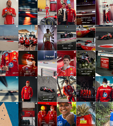
Case Study: The Rosso Corsa Authority
Few brands command a color as absolutely as Scuderia Ferrari. Their digital presence is a masterclass in using a singular, "hero" hue to establish instant brand recognition.
- The Anchor: Their unmistakable Rosso Corsa red is more than a color; it is a signal of performance, heritage, and prestige. It creates a "pre-cognitive" brand moment—you feel the Ferrari identity before you even process the logo.
- The Strategic Counterpoint: Ferrari masters the art of balance. By setting their signature red against a sophisticated foundation of neutral blacks, greys, and architectural whites, they amplify the visual impact of the car.
- The Narrative Accents: Secondary tones—the Giallo (yellow) of the Ferrari shield and the tactical blues of partners like HP—are never decorative. They are integrated with a precision that reflects real-world synergy without compromising the core aesthetic.
The result is a cohesive ecosystem where color alone communicates speed and excellence. In a fast-scrolling world, Ferrari doesn't just compete for attention; it commands it through a disciplined, high-contrast palette system.
The House Palette: Designing the Unique Image Identity
When we defined our own visual signature, the selection of Imperial Purple was a deliberate act of brand positioning. Historically associated with royalty and rare intellect, purple serves as the perfect conduit for our core pillars: visionary creativity balanced by strategic precision.
For us, this shade is more than an aesthetic; it is a psychological anchor. It signals a premium tier of service while simultaneously stimulating the "bold thinking" our clients expect. It mirrors our internal methodology—imaginative in its inception, yet disciplined and purposeful in its execution.
2026: The New Frontiers of Visual Communication
To lead in the current market, a brand's color system must account for more than just aesthetics. We are seeing a profound shift in how audiences "consume" color, driven by three pivotal pillars.
1. Ecological Awareness & The "Bio-Digital" Palette
Sustainability has moved from a corporate checklist to a visual language. In 2026, high-end brands are pivoting away from aggressive, synthetic neons in favor of "Bio-Digital" hues—colors that feel organic yet vibrant. Think of deep, mineral earth tones paired with the hyper-clarity of digital displays. This signals a brand that is grounded in the physical world while remaining technologically sophisticated.
2. Combating Digital Fatigue with "Retinal Rest"
As consumers spend more time in immersive digital environments, "eye strain" has become a design constraint. Luxury branding is now leaning into Retinal Rest—the strategic use of low-saturation palettes and "warm" whites to provide a sense of visual sanctuary. By choosing colors that are easier on the eyes, your brand creates a subconscious feeling of relief and comfort, encouraging longer engagement with your content.
3. AI-Driven Design vs. Human Intentionality
While AI can generate a thousand palettes in seconds, it often lacks the "soul" of human narrative. At a boutique level, the 85:15 ratio of human intuition to machine data is our gold standard. We use AI to analyze vast datasets of consumer heatmaps, but the final selection is guided by human emotion.
The Boutique Advantage: In an era of AI-generated noise, intentionality is the ultimate luxury. A palette that feels "curated" rather than "calculated" is what creates a lasting brand legacy.
The 2026 Shift: Cultural Chromatics
While the core psychology of color remains constant, the application of those tones evolves alongside global shifts. Each year, the industry looks to Pantone to synthesize these cultural movements into a singular visual narrative. These trends ripple through every touchpoint of the luxury market—from high-fashion textiles and architectural interiors to the interface of a bespoke digital experience.
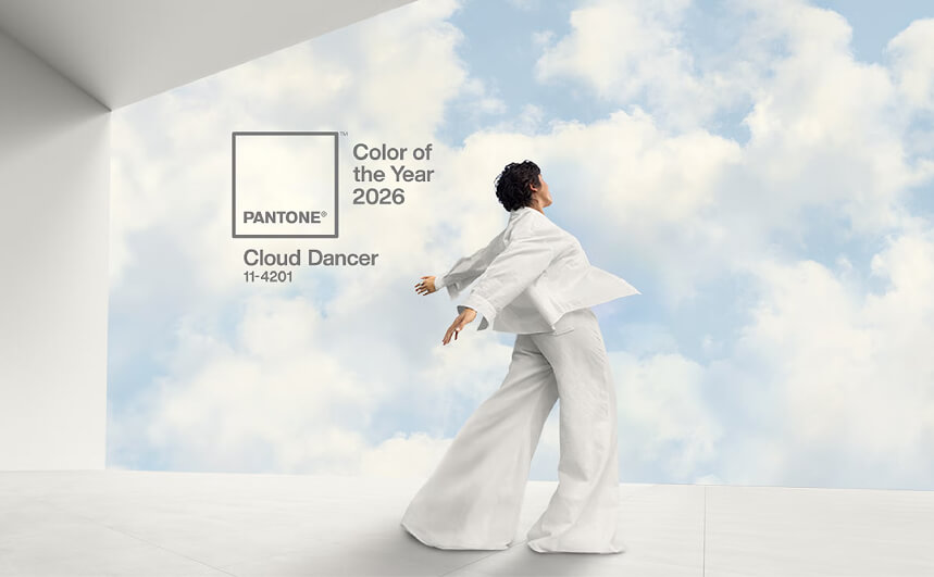
The 2026 Color of the Year: Cloud Dancer (PANTONE 11-4201)
For 2026, the selection of Cloud Dancer marks a definitive move toward Visual Minimalism and Mental Clarity. In an increasingly hyper-stimulated world, this elevated, fresh and "breathable" white offers a much-needed sense of quiet sophistication.
- The Function: It acts as visual breathing room, a neutral expanse that allows more dominant brand colors to resonate with greater clarity.
- The Synergy: We are seeing Cloud Dancer paired seamlessly with muted, mineral pastels and earthy neutrals. This reflects a broader consumer shift toward organic, refined aesthetics—moving away from the artificial and toward the authentic.
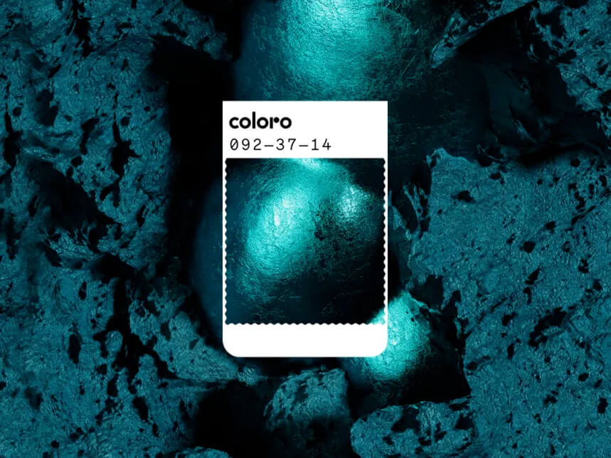
WGSN & Coloro: The Rise of Transformative Teal
While Pantone offers a sense of "climatological" calm, the forecast from WGSN and Coloro introduces a more active, restorative energy: Transformative Teal.
A sophisticated fusion of deep aquatic blue and oxygenating green, this shade is the visual manifestation of the 2026 shift toward Ecological Consciousness. It is not merely a color; it is a signal of "The Great Redirection"—a global movement toward more intentional, responsible consumption.
In the luxury landscape, Transformative Teal serves two critical functions:
- The Ethical Signal: As sustainability becomes a non-negotiable for the modern consumer, this hue acts as a silent shorthand for brand values. It suggests a brand that is stewardship-driven without sacrificing premium aesthetics.
- The Bio-Digital Bridge: This particular teal sits at the intersection of the natural world and our digital future. It feels as at home in a high-tech interface as it does in organic, sustainable packaging.
At Unique Image, we view the adoption of such tones as a Visual Vow. It tells your audience that your brand is not just observing the world, but actively participating in its restoration.
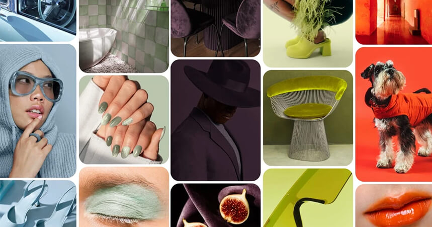
The Pinterest Pulse: Five Shades Defining the 2026 Visual Narrative
Pinterest remains the ultimate barometer of consumer aspiration. Their 2026 palette reflects a collective desire for two extremes: restorative serenity and high-octane personality. Here is how these five shades are reshaping the digital landscape.
1. Cool Blue: The Glacial Pause
A pale, translucent tone with crisp, icy undertones, Cool Blue is the antidote to digital overwhelm. It feels breathable and visually quiet. As audiences crave "digital sanctuary," this shade taps into a broader movement toward restorative, serene branding that lowers the cognitive load of the viewer.
2. Jade: The New Organic Standard
Sitting precisely between mint and moss, Jade is muted, earthy, and undeniably refined. It provides a stabilizing presence in a brand identity. It performs exceptionally well in high-end markets because it balances the softness of nature with a polished, architectural presence.
3. Plum Noir: The Cinematic Depth
One of the fastest-growing shades in the 2026 forecast, Plum Noir is a deep, intellectual purple infused with burgundy and umber. It carries an air of mystery and "old world" luxury. These dark, layered tones increase the perceived value of a brand, creating a cinematic quality that invites users to "save" and return to the visual.
4. Wasabi: The Luminous Disruptor
Wasabi is an electric, yellow-green fusion—sharper and more luminous than the neons of years past. While it pulls from the energy of Y2K nostalgia, this iteration feels fresher and more intentional. It is a "high-visibility" tool used to inject a sense of avant-garde energy into a legacy brand.
5. Persimmon: The Dopamine Anchor
Positioned at the intersection of tangerine and sun-ripened tomato, Persimmon is warm, visceral, and emotionally inviting. This is a "dopamine color." It stimulates high engagement and curiosity without the aggressive friction of a traditional primary red. It feels joyful yet sophisticated—a rare combination that makes it highly shareable.
The Strategy of Stability: Beyond the Trend
While understanding the shifting 2026 landscape provides a vital competitive edge, a premium brand must balance evolution with chromatic integrity. Not every forecast will align with your specific architecture or the emotional sanctuary you wish to build for your clients.
Consistency is the silent architect of brand equity. It transforms a simple visual into a reliable psychological anchor. The data is definitive: one in three consumers report higher loyalty to brands that maintain a disciplined, consistent color story. Conversely, a staggering 12% of consumers have abandoned a brand following an inconsistent or jarring color shift. In the high-end market, stability is a form of prestige.
Designing Your 2026 Visual Legacy
Color influences emotion, triggers memory, and drives conversion—often seconds before the conscious mind even begins to process your copy. In 2026, recognizing the visceral role of visual identity is no longer optional; it is the baseline for relevance.
Before your audience ever reads your mission statement, they have already "felt" your brand through its palette.
At Unique Image, we treat color as a strategic foundation rather than a decorative layer. When chosen with intention and applied with precision, it ensures you are not just seen—you are remembered. That initial, instinctive response is where our strategy begins.
Design Your Visual Legacy
Discover how Unique Image can craft a strategic color system that transforms perception and drives brand awareness
Begin Your Transformation