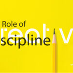
The Invisible Work of Good Design

Because what you don’t see is what makes it work
Most people experience design as decoration. But professionals know better: design is structure, psychology, intention, and—yes—ethics. The best design isn’t just pretty. It’s principled. It works because of what’s invisible: the decisions, the disciplines, and the disciplines behind the decisions.
Let’s unpack the invisible layers that separate design that merely looks good from design that is good.
Grid Systems: The Skeleton You Never See
You don’t notice a grid when it’s working—but you feel it. It’s the reason Apple’s website feels balanced, even with complex product layouts. It’s why editorial spreads in Vogue feel elegant, never chaotic. A good designer uses invisible grids to guide your eye and create harmony.
Invisible Impact: At Unique Image, we structure every page—digital or print—on precise grid systems. Even when a layout feels spontaneous, the underlying math ensures clarity, rhythm, and readability.
Let’s unpack the invisible layers that separate design that merely looks good from design that is good.
Typography: Tone Without a Voice
Typography is your brand’s body language. Serif fonts suggest legacy and authority (think The New York Times). Sans-serif fonts convey modernity and minimalism (think Google). Good design chooses fonts that feel right—without needing to explain why.
Real-life choice: When we rebranded a luxury client with heritage roots, we paired a classic serif with generous spacing—not trendy, but timeless.
Whitespace: The Confidence to Breathe
Whitespace isn’t empty. It’s elegant. Ethical. Intentional. It shows you respect your audience’s attention span and don’t need to crowd their minds with noise.
Design mistake to avoid: Startups often fear empty space and try to fill it all—resulting in stress-inducing visuals. Good design resists that urge. It’s not about cramming value in—it’s about carving clarity out.
Color: A Language With No Translation
Color signals emotion, status, and cultural values. Rooted in feng shui, color carries profound meaning: deep blues and blacks foster wisdom and trust in the North, greens invite growth and renewal in the East, reds spark passion and visibility in the South, whites and grays bring clarity and support in the West, and warm earth tones ground and balance the Center. At Unique Image, we chose purple for its rare blend of fiery energy and serene depth — a symbol of creativity, transformation, and distinction. Just as Pepsi blends bold reds, crisp whites, and deep blues to connect heritage with modern appeal, and other iconic brands use color to tell their stories, our purple captures the heart of who we are and the experience we create. Ethical designers consider context, accessibility (e.g., colorblind-friendly palettes), and brand psychology.
Real-world relevance: Color plays a significant role in how people perceive and interpret information. Understanding the different cultural associations and meanings of colors can help designers effectively communicate their intended message and connect with their target audience. By considering context, accessibility, and brand psychology, designers can create more inclusive and impactful designs that resonate with a diverse range of individuals.Color can influence consumer behavior, impact brand recognition, and convey specific emotions or messages. Therefore, it is essential for designers to be mindful of the cultural significance of colors and the potential implications of their color choices in order to create successful and meaningful designs.
Ethics: The Hidden Layer of Every Decision
Design isn’t neutral. The shape of a button can manipulate behavior. A headline’s placement can frame a narrative. Fonts can bias perception. In an age of dark patterns and attention hacking, design ethics matter more than ever.
Design integrity: We avoid “clickbait UI”—like false urgency or misleading CTAs—and prioritize clear, respectful user flows. Because what you build reflects what you believe.
Real-world relevance: Color plays a significant role in how people perceive and interpret information. Understanding the different cultural associations and meanings of colors can help designers effectively communicate their intended message and connect with their target audience. By considering context, accessibility, and brand psychology, designers can create more inclusive and impactful designs that resonate with a diverse range of individuals.Color can influence consumer behavior, impact brand recognition, and convey specific emotions or messages. Therefore, it is essential for designers to be mindful of the cultural significance of colors and the potential implications of their color choices in order to create successful and meaningful designs.
Consistency: The Trust Multiplier
From your logo on a business card to your Instagram posts—consistency builds recognition, and recognition builds trust.We believe in the power of consistency to increase brand recognition and trust. From your logo on a business card to your Instagram posts, every element should work cohesively to convey a meaningful message. This is where a strong design system can make all the difference.
Unique Tip: Brands like Airbnb and IBM release public design systems. Why? Because consistency is scale—and scale is trust.
Design That Disappears… Until It’s Missing
When design is good, it disappears into the experience. But when it’s bad, it’s all you notice. Misaligned margins. Clashing colors. Inaccessible interfaces. They don’t just frustrate users—they erode brand value.
At Unique Image, we design with intention, not just inspiration. We see the unseen. We fine-tune what others overlook. Because we know: real design happens long before the first pixel is placed.
Want a second set of eyes on your brand’s design language?
Let’s uncover what your audience is really seeing—and what they’re not.